What is an Email Preheader and How Can it Increase Email Open Rates?
Email preheader might not seem particularly important, but it’s one of the very first things readers see when they look at your emails. A good preheader can encourage somebody to open your email, while a bad preheader can lead to ignored emails.
What is a preheader?
Email preheader text is a small line of text that appears after the subject line in an email inbox. Email preheaders give a short summary of the contents of an email, and may appear differently on mobile and web email clients.

When Recipient look at the emails in the inbox, they only get a brief look at each email. All they see in the inbox are email subject lines, the name of the sender, and the preheader.
A good preheader can draw attention and convince recipient to open your emails just like a catchy subject line can.
Preheader best practices
Following best practices is important if you want to write the best preheaders. Keeping up with the latest trends can help you write attention-grabbing headers that give your emails a boost, especially if you’re willing to put in the time and effort. If you want to write better email preheaders, here are some best practices you should follow.
Length
Length is one of the most important things to consider when it comes to your preheader. Email preheaders are typically pretty short, but you don’t want to make your preheader so short that there’s no information in it. On the other hand, making your preheader too long takes away from the summary element of preheaders.
In many cases, email preheaders are about 85 to 100 characters in length. The problem with this is that email devices need to be shorter for mobile devices, If you want to make sure your email headers are tailored to fit a wide range of devices, you should keep your email preheader between 30 and 80 characters. There’s nothing wrong with a short preheader if it conveys your message properly.
Add a call to action
You might think a call to action is only for the end of your emails, but they can be very effective in preheader text as well.As far as your call to action goes, it could be anything. As long as you’re getting the attention of people who are reading your email preheaders and convincing them to open your emails, you’re doing it right.
A preheader call to action follows all the same rules as a normal call to action:
- Keep it short (you don’t have much room anyway)
- Make it sound easy
- Promise a benefit
Make your subject line and preheader text work together
Like Open Books, you can use your email subject line and preheader together to make your message hit stronger.
Your subject line is probably only 30-75 characters long – adding preheader text gives you another 100 characters to play with! Treat your email preheader as a second chance at a first impression. Put more work into it than just repeating the subject line.
Use emojis carefully
A person’s inbox is likely to have more promotional emails – which means you need to make your emails more enticing, emojis are becoming increasingly popular in preheader lines.However, testing is crucial. Try an A/B split, comparing a subject line with emojis versus one without. See if there is a difference in opens, clicks, and conversions.
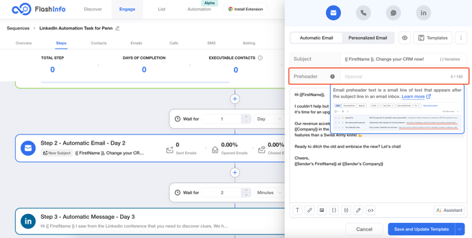
Adding a preheader with FlashInfo
The good news is, FlashInfo makes it easy to view and edit preheader in emails campaign. If you want to add a preheader with FlashInfo, here’s a quick walkthrough.
1. Choose one Seqeunce you want to use
2. Click on "Step" label
3. Add or Edit the "Automatic Email" Step 4. Enter your text in "Preheader" section
